Things to Love #1: Mid-Century Modern Design
I have a hard time picking just one style for anything. In residential architecture, I love Craftsman, Tudor, Gothic, and more. Including Mid-Century Modern. This love of Mod transfers to things other than architecture, as well. I love the style in furniture, shapes and patterns, advertisements, movie intros, and, yes, houses. This post will serve as a (very brief) introduction to it. My fond recollections of our boomerang countertops when I was little probably contributed to my tastes.
Mid-Century Modern style began, naturally, in the middle decades of the 20th century. It includes some interesting shapes and patterns, with a lot of organic lines in some areas and straight lines in others.
Houses
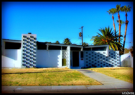
Houses were often low and wide, with a lot of plate glass windows. Some had gently sloping rooflines.
Furniture
Furniture often used a combination of materials, such as well-cushioned chairs with wood legs and arm rests, or resin chairs with metal legs. Rounded rectangles, curved designs, angled legs, a mix of natural and man-made materials. Check out Charles and Ray Eames.
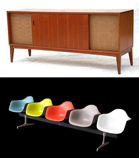
Top: Clairtone Stereo Cabinet by Flickr User Stephen Coles (CC BY-NC-SA 2.0). Bottom: Line of Eames Chairs by Flickr User Rama (CC BY-SA 2.0 FR)
Shapes and Patterns
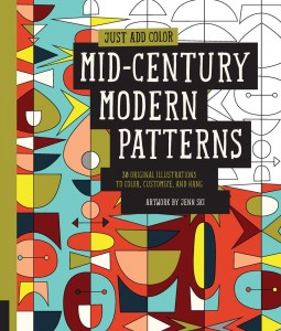
Boomerangs. Stars. Geometric shapes. Organic design. Atomic age imagery. Think: The Jetsons. (There are a slew of coloring books that cover this. I want them all.) Here we find a lot more Eames.
Advertisements and Movie Intros
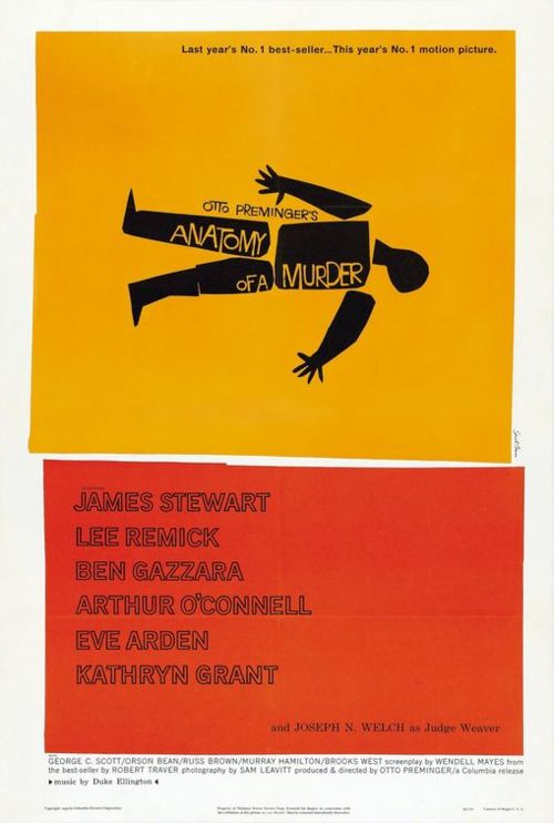
Saul Bass was a master at design. For decades he created iconic and interesting logos, designs, and movie visuals. He designed the Bell Telephone logo and the Girl Scouts of America logo. He did movie opening credits imagery for movies by Otto Preminger, Alfred Hitchcock, and Billy Wilder, showing that the opening credits could truly add something to a film.

